KidFit is Bengaluru’s first DMI-based pediatric rehabilitation clinic, focused on helping children overcome developmental and motor challenges through globally recognized therapy techniques. When they approached Strads Agency, they were looking for more than just a logo; they wanted a visual identity that could reflect the care, science, and progress that defines their mission.
Despite having a strong medical foundation and a visionary team, KidFit lacked a brand identity that communicated their expertise and compassion. Their existing visuals didn’t evoke trust or emotional connection, which are essential in a pediatric healthcare environment. They needed a branding solution that would be professional enough to earn the confidence of doctors and partners while also feeling safe and welcoming for families and children.
Our goal was to create a design system that projected both medical credibility and emotional warmth. The identity needed to resonate with parents, pediatricians, and therapists alike, building a bridge of trust from the very first impression.
We began with a deep understanding of KidFit’s therapeutic approach and its audience. We studied the emotional journey of the families, the science behind DMI therapy, and the competitive landscape. This allowed us to identify the unique intersection of clinical excellence and human care that defines KidFit, and we built the brand identity to reflect just that.
The logo concept was born by merging the letter “K” with abstract shapes symbolizing movement and progress, a nod to the therapy’s goal of helping children achieve motion and independence. The mark feels modern and clean, yet emotionally accessible, setting the tone for a brand that is both professional and empathetic.
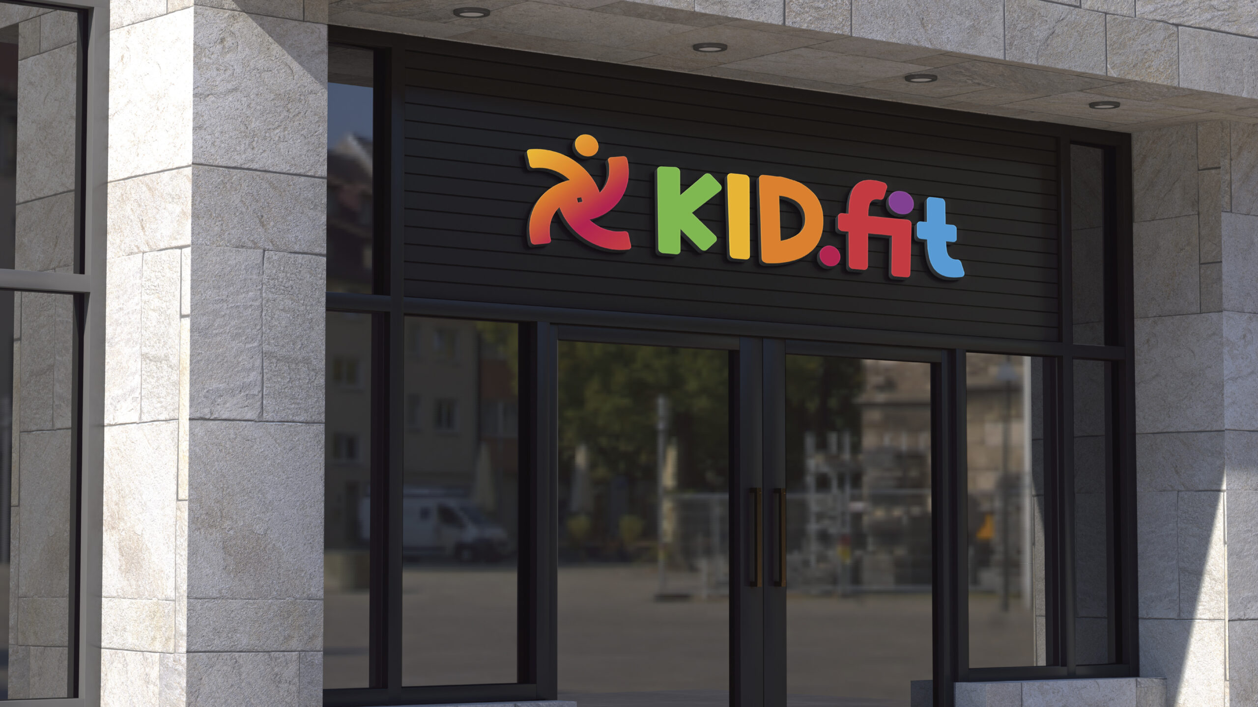
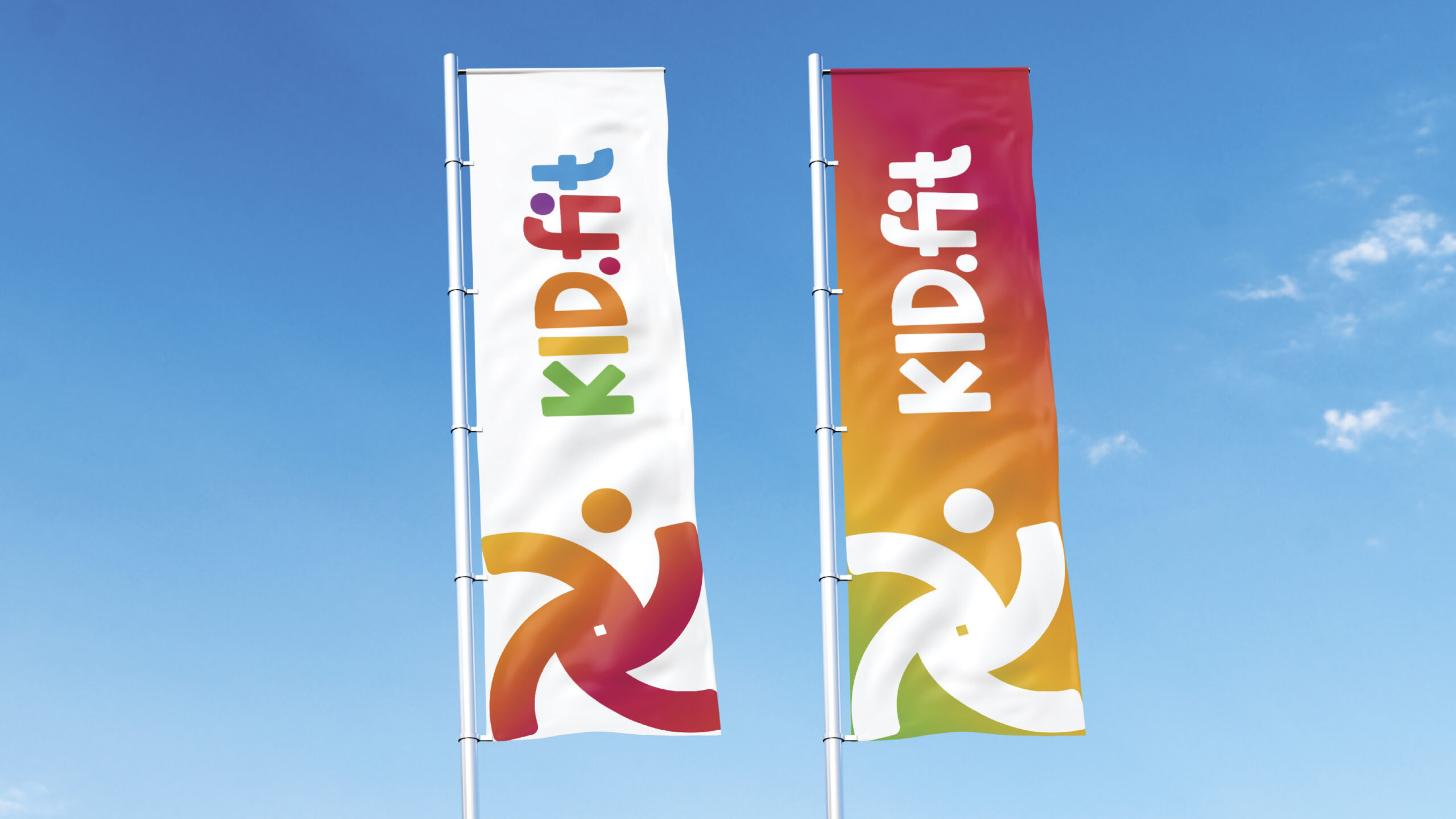
We crafted a vibrant yet thoughtful color palette to reflect growth, energy, and trust. Green symbolizes healing and development, while orange and yellow express vitality and joy. Blue evokes a sense of trust and clinical reliability, and purple introduces a feeling of supportiveness and diversity. The overall feel is friendly, optimistic, and grounded, perfectly matching the tone of a clinic that helps children grow with confidence.
The rebranding helped KidFit build a strong emotional and professional presence. Parents instantly felt more confident in the brand, while the team finally had visuals that reflected the value they offer. Social media engagement improved, and the overall brand recognition in the community grew steadily. It was more than a logo; it was a complete transformation in how KidFit was seen, trusted, and remembered.