SEED is not just an investment firm; it’s a launchpad for startups with potential. When the team behind SEED approached Strads, their vision was bold yet focused. They weren’t only offering capital; they wanted to invest their time, experience, and strategies into helping early-stage startups scale faster, smarter, and more sustainably. But their existing identity didn’t reflect that purpose. What they needed wasn’t just a logo. They needed a brand built for trust, growth, and future ambition, one that made them look like the kind of brand that starts unicorns.
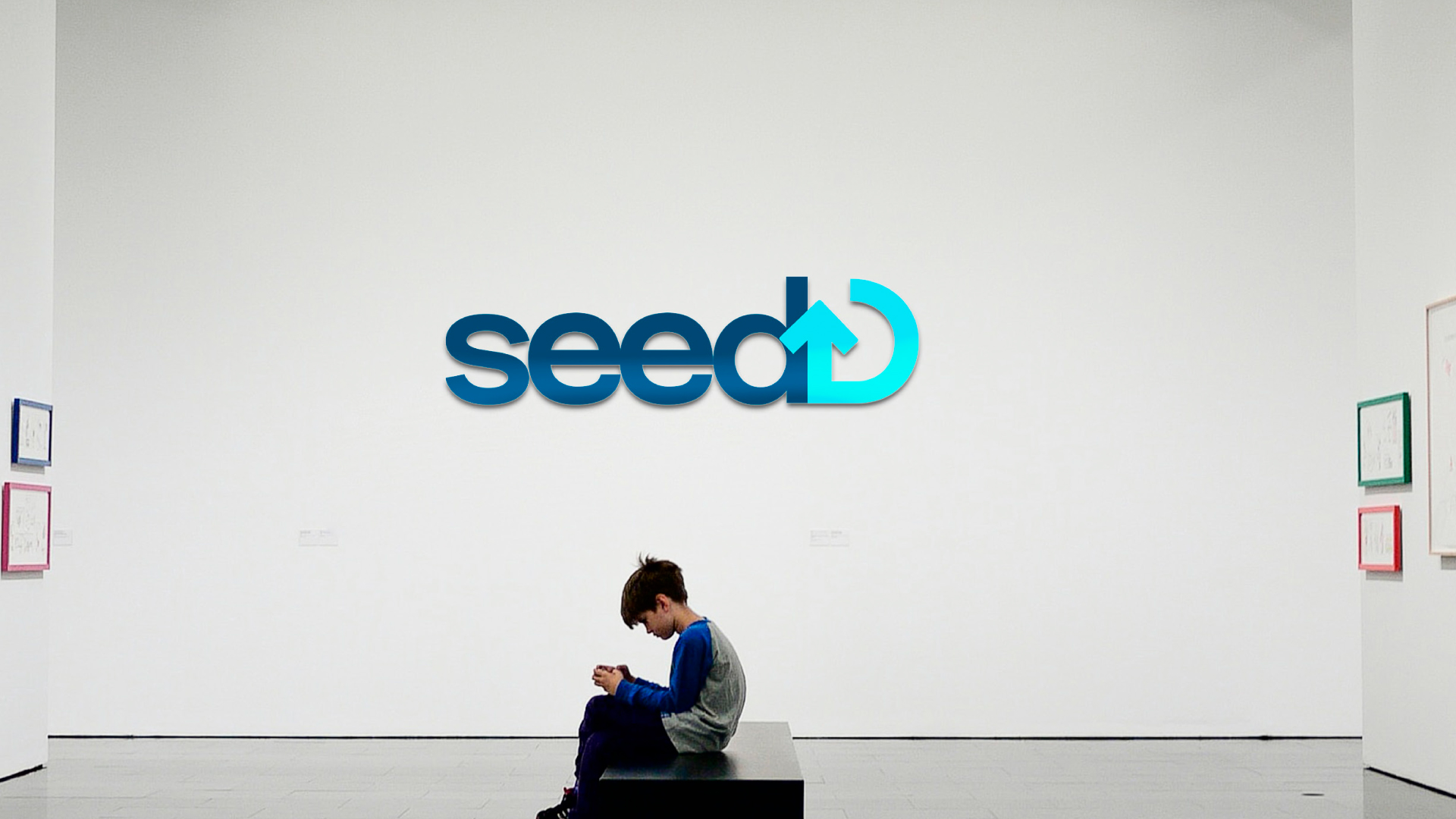
SEED needed a brand that could speak clearly to two very different audiences: startup founders who needed to believe in their support and future investors who needed to see credibility and seriousness. The identity had to reflect growth in every visual cue, from the name to the mark, and feel like something built to last.
Before design ever began, we dug into SEED’s DNA. Who are they helping? Early-stage, scalable startups. What do they bring? Equity funding with real strategic guidance. What sets them apart? They stay in the game, offering mentorship, planning, and growth support long after the first investment. This clarity became the foundation for every creative decision that followed.
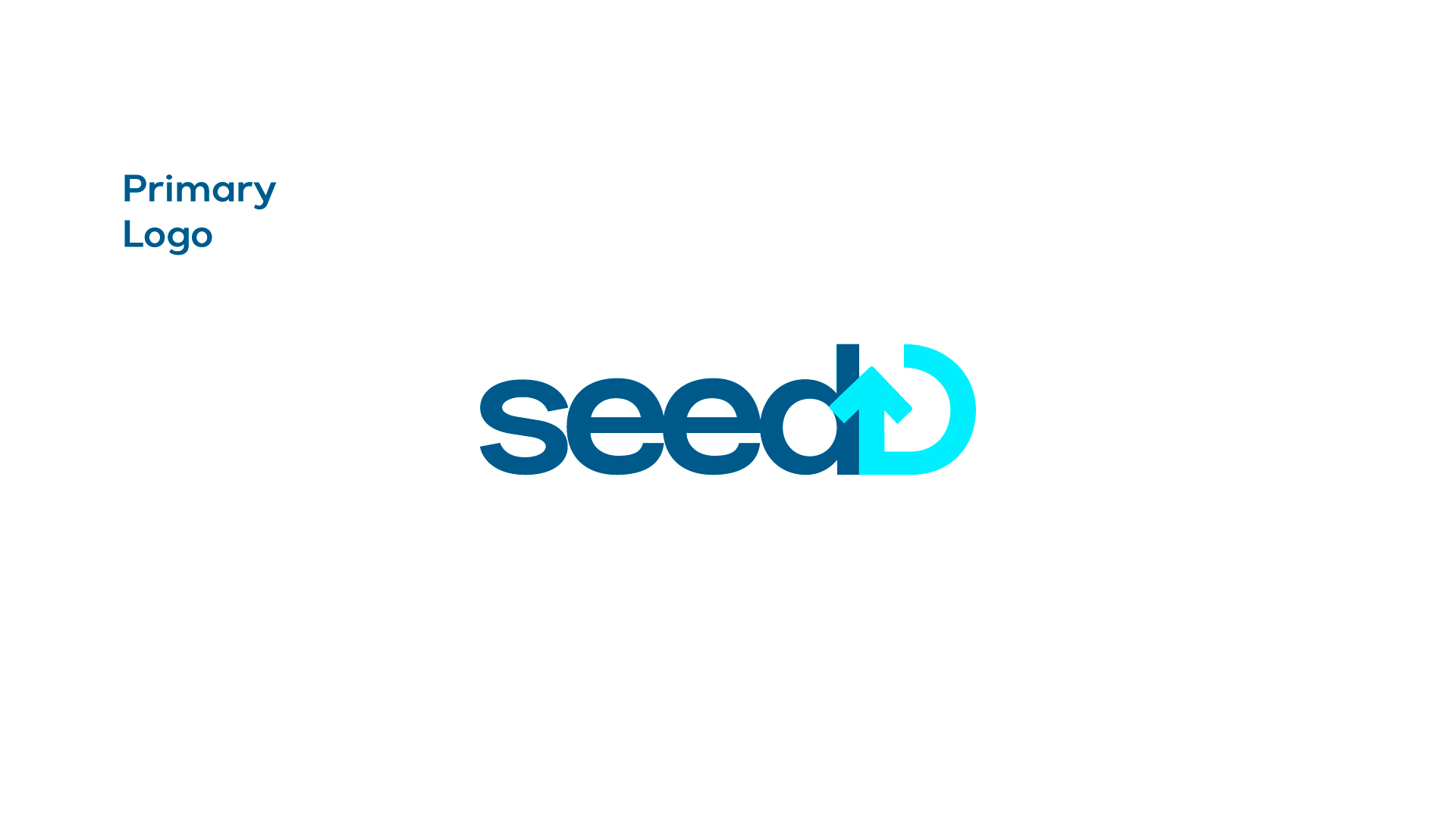
We wanted the SEED brand to feel strong, clear, and future-forward but also grounded in trust. The logo became a custom wordmark with a subtle rising seed icon, capturing the idea of early potential growing into lasting success. The color palette was built around deep green, representing growth and forward momentum, balanced with soft gray tones to add professionalism and calm. The font choices used rounded forms with bold weights, creating a feel that’s friendly, solid, and built for digital scale.
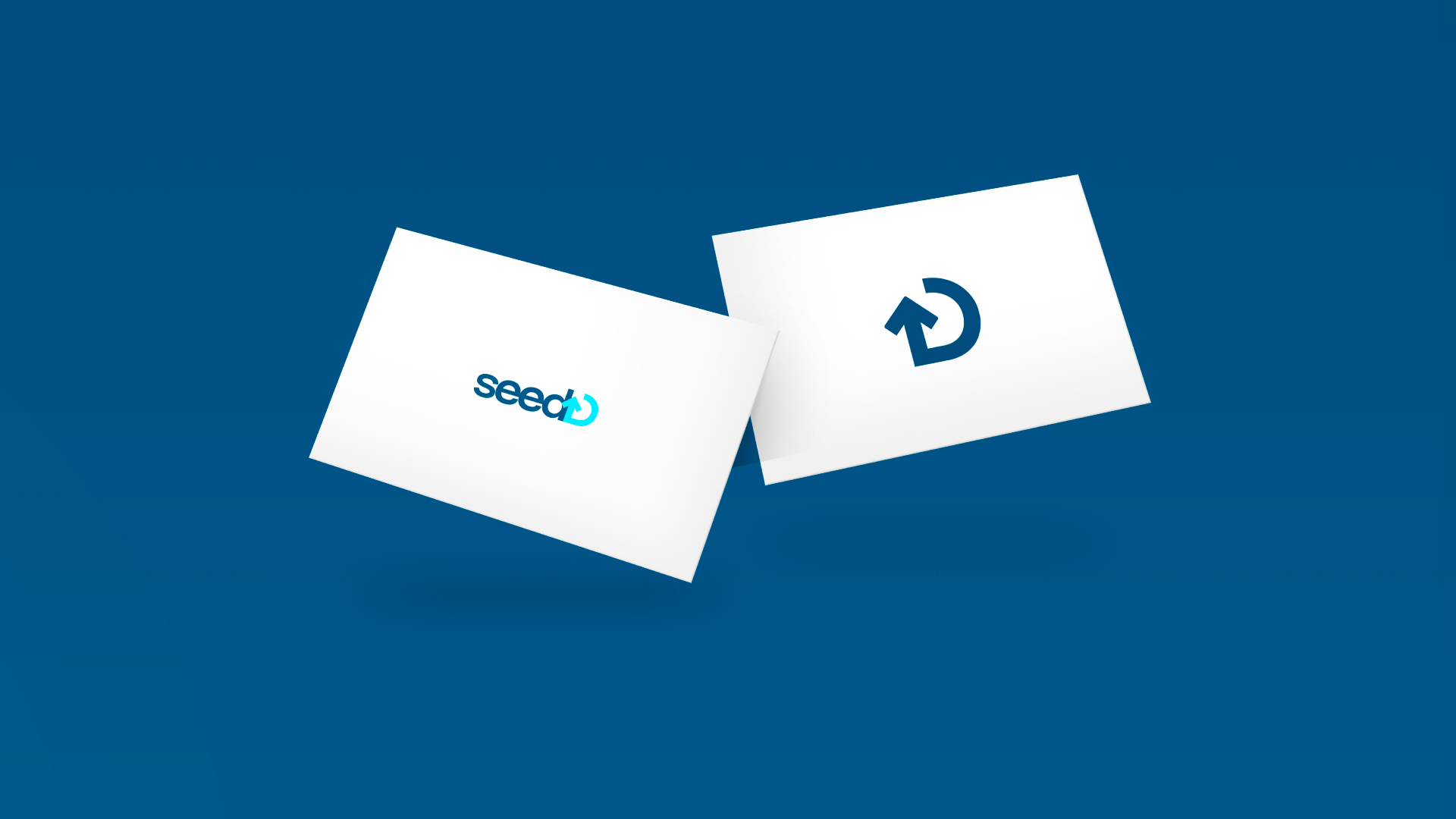
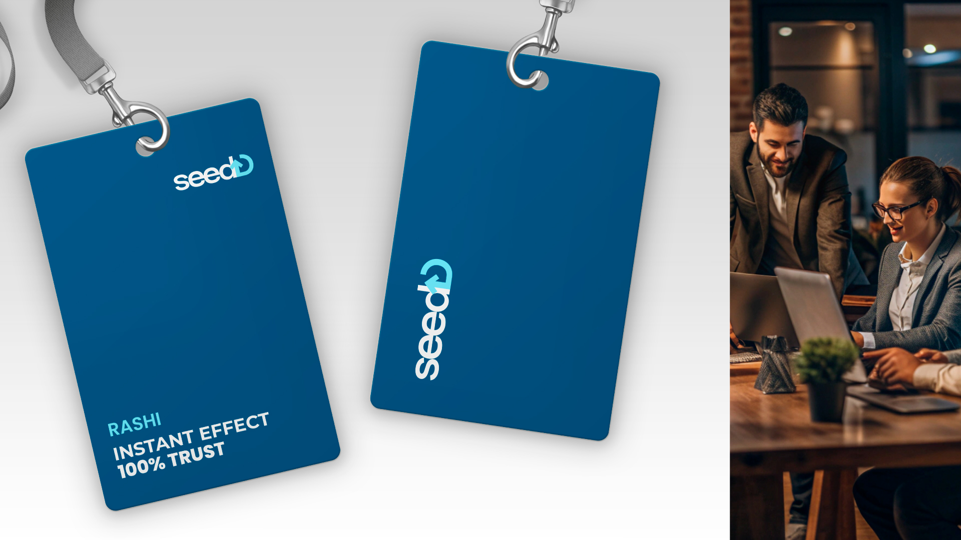
We brought the brand to life across all essential touchpoints. The logo system included variations for different uses, from primary and icon versions to dark/light formats. Business cards, pitch decks, investor folders, and even website wireframes were designed to keep everything consistent and scalable. We also refined their copywriting voice, sharp, clear, and focused, with no fluff or filler. Every element of the identity was built to make SEED feel confident in the rooms where decisions happen.
After launch, SEED didn’t just look better; they performed better. Their outreach materials began making stronger first impressions. Founders started seeing them as more than investors; they were growth allies. Their deck felt clearer, their presence felt stronger, and their name carried more weight in conversations. The identity helped them not only build trust but also build momentum.
SEED helps startups grow. Strads helped SEED grow. This is branding powered by clarity, purpose, and vision. This is what we call a Strads Impact.
